Now our dataset is nice and tidy we can move on with visualising it to see what insights we can draw. Lets start by looking at directional traffic flow for each location using averaged daily data. This is an ideal situation to use Seaborn’s FacetGrid facility which allows for the plotting of a large number of subplots using common axis values. Using a semicolon after the last command in a cell prevents display of the object type making for a cleaner notebook.
# lets plot basic activity across an averaged day for each location
daily_stats = bike_df.pivot_table(index=['counter_id','time'], aggfunc = 'mean')
daily_stats = daily_stats.reset_index(level=['counter_id', 'time'])
grid = sns.FacetGrid(daily_stats, col = "counter_id", col_wrap = 5)
grid.map(plt.plot, "time", "direction_A", color="c")
grid.map(plt.plot, "time", "direction_B", color="r")
grid.set_axis_labels(x_var="Time", y_var="Bikes");
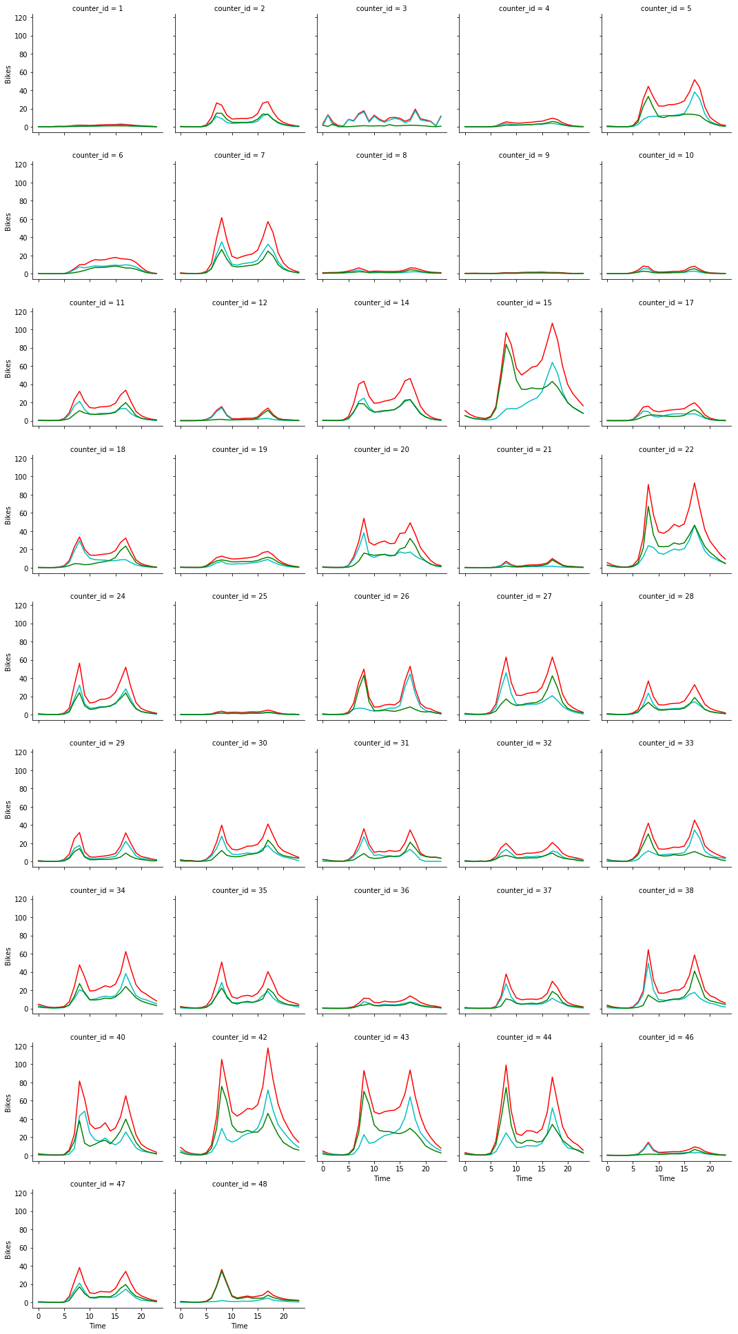
As we can see there are two main spikes in activity corresponding to the morning and evening rush hours at most locations. we can also see the widely variable usage of different locations. Finally the directions of travel can be inferred if required by looking at the cyan and green lines for directional travel and noting their rush hour peaks.
There are some interesting differences though. Some locations like counter 21 have extremely directional flow patterns dependent on time of day (suggesting they may be on major arterial routes into the city centre, while others like counter 20 have a more even distribution suggesting two way traffic at rush hour. Other counters like number 6 show no real rush hours suggesting that perhaps they are not widely used by commuters.
Next lets look at weekly travel patterns averaged across all counters
# lets plot total activity by day for all locations
weekly_stats = bike_df.pivot_table(index=['Day_no'], aggfunc = np.sum)
weekly_stats = weekly_stats.reset_index(level=['Day_no'])
figure, axes = plt.subplots(figsize = (10,10))
grid = sns.barplot(x = "Day_no", y = "Total", data = weekly_stats, ax = axes, palette = "husl")
grid.set_xlabel("Day")
grid.set_xticklabels(labels = ["M", "T", "W", "T", "F", "S", "S"]);
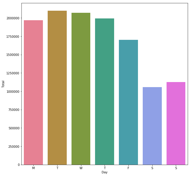
This gives us a plot showing higher traffic during the week compared to weekends. We can also see a slight dip in traffic on Fridays, possibly people taking the day off or leaving their bike behind so that they can go out with friends from work. We can look at the same trends on a counter by counter basis using a FacetGrid again
# lets plot basic activity across an averaged day for each location
weekly_stats = bike_df.pivot_table(index=['counter_id','Day_no'], aggfunc = 'mean')
weekly_stats = weekly_stats.reset_index(level=['counter_id', 'Day_no'])
grid = sns.FacetGrid(weekly_stats, col = "counter_id", col_wrap = 5)
grid.map(sns.barplot, "Day_no", "Total", alpha = 0.5, palette="husl")
#grid.map(sns.barplot, "Day_no", "direction_B", alpha = 0.5, color = 'r')
grid.set_axis_labels(x_var="Day", y_var="Bikes")
grid.set_xticklabels(labels = ["M", "T", "W", "T", "F", "S", "S"]);
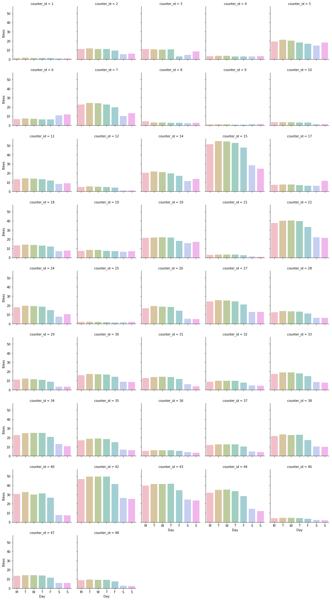
With this more detailed view we can see that there are a few locations like counter 6 which run counter to the general trend, displaying higher traffic at the weekend and we can hypothesise that these must be located on more recreational cycle routes.
We can also look at seasonal variation in bike travel trends
# lets plot basic activity across an averaged day for all locations
weekly_stats = bike_df.pivot_table(index=['Month'], aggfunc = "mean")
weekly_stats = weekly_stats.reset_index(level=['Month'])
figure, axes = plt.subplots(figsize = (10,10))
grid = sns.barplot(x = "Month", y = "Total", data = weekly_stats, palette = "muted", ax = axes)
grid.set_xlabel("Month")
grid.set_xticklabels(labels = ["Jan", "Feb", "Mar", "Apr", "May", "Jun", "Jul", "Aug", "Sep", "Oct", "Nov", "Dec"]);
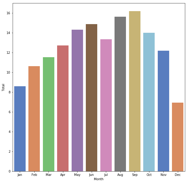
This plot clearly reveals the seasonal nature of cycling in Edinburgh, with far higher traffic in the summer as compared to the winter.
Unfortunately upon attempting to plot data on a per station basis numerous data gaps become evident, these are due to the fact that the deployments of counters varied in duration, many of the individual datasets have unbalanced data as a result. Also the data often has unexpected radical dips in activity which suggest that individual counters may have been out of action for some months.

Indeed the patchy nature of the dataset more or less rules out perhaps the most interesting use to which it could be put, that is to determine the long term trend in cycle usage. We can see this if we plot another facet grid to show yearly activity by counter.
# lets plot basic activity across an everaged day for each location
weekly_stats = bike_df.pivot_table(index=['counter_id','Year'], aggfunc = 'mean', dropna=False)
weekly_stats = weekly_stats.reset_index(level=['counter_id', 'Year'])
# to ensure all years print we need to add some zero rows to the last element of
# the FacetGrid by adding lines to the dataframe
for i in range(0, 7):
    weekly_stats.loc[len(weekly_stats.index) + i] = [48, 2008+i,0,0,0,0,0,0,0,0,0,0]
#now we can plot
grid = sns.FacetGrid(weekly_stats, col = "counter_id", col_wrap = 5)
grid.map(sns.barplot, "Year", "Total", alpha = 0.5, palette="dark")
grid.set_axis_labels(x_var="Year", y_var="Bikes");
grid.set_xticklabels(labels = ["08", "09", "10", "11", "12", "13", "14", "15", "16"]);
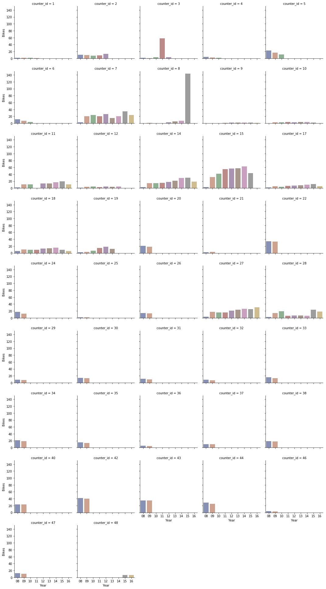
We can clearly see that we do not have comparable data across the full range of years, unfortunately the individual counters were simply not installed for long enough to give us really reliable time data. This flaw in data collection means the data just cannot tell us whether bike usage in Edinburgh is increasing or decreasing (though the trends on counters 12, 18, 21, 22,24 and 32 which were all installed for long periods of time do look encouraging). The lesson here is that planning the correct data capture is vital to ensure that meaningful conclusions can be drawn from the resultant data.
In the final part of this analysis, we shall put the locations of the counters into context by plotting visually on a map.