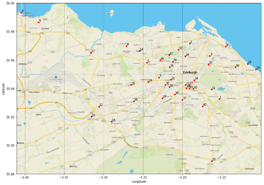
We have visualised our data by counting station, but that is rather hard to put into context without knowing where our counting stations are located. Unfortunately the dataset does not come with location data for the counters built in, but all is not lost.
The names of the CSV files correspond to road names. We can use these names to locate the counters on a map. Using the geolocation tool provided at http://boundingbox.klokantech.com/ we can obtain an approximate latitude and longitude value for each location. I have stored this location data in a handy CSV file. We can then use these to plot our data onto a section of Open Street Map.
The basic strategy is to use MatPlotLib‘s built in image display capability to show the map, and then to plot the locations as an annotated scatter plot on top. The key trick here is to specify the extent for the image axes during our axes.imshow call using the latitude and longitude bounds of our map section. this ensures that the scatter plot lines up correctly as an overlay. We also specify an aspect ratio to ensure that we get a good looking recognisable map.
To annotate the map we simply cycle over the dataframe rows using their values as annotations and coordinates.
# lets scatter plot the locations
# first retrieve the locations
os.chdir(directory)
location_df = pd.read_csv("OSM_locations.csv")
location_df.head()
# specify the coordinates of our map section
left_m = -3.4101
right_m = -3.1002
top_m = 56.0000
bottom_m = 55.8800
v_scale = 1.8
# load our map and print it
image = plt.imread('EdinburghOSM.png')
figure, axes = plt.subplots(figsize = (15,15))
axes.imshow(image, extent = [left_m, right_m, bottom_m, top_m], aspect=v_scale)
# then add our locations as a scatter plot on top
location_df.plot(x= "Longitude", y = "Latitude", kind = "scatter", color ='r', ax = axes)
# finally add annotations to the points
for row in location_df.itertuples():
    # slightly offset the labels for clarity
    axes.annotate(row[1], (row[3]+0.0005, row[4]+0.0005));
This gives us a nice looking map clearly showing the locations of the counters which can be used in conjunction with the facet plots to interpret our data.
We can even add some further information to this plot by varying the size of the circles to represent average traffic levels. To do this we need to be certain that our plotting coordinates are made to correspond to the correct data from our dataset. The safest way to do this is to merge the location data with a pivoted version of our main dataframe from the previous sections
#lets create a new dataframe with the average journeys by location
local_traffic_df = bike_df.pivot_table(columns = ["counter_id"], aggfunc = "mean").T
local_traffic_df.reset_index(inplace= True)
local_traffic_df = local_traffic_df[["counter_id", "Total"]].copy()
traffic_pattern_df = pd.merge(location_df, local_traffic_df, left_on = "Code", right_on = "counter_id")
Once we have done this, there is one final wrinkle. Even though we are using the pandas pd.plot.scatter method to plot the data it would appear that the point size argument ‘s’ will not accept a column from a panda’s dataframe as input. Therefore we need to extract our traffic data into a list to pass to the plotting function.
# now we are certain our data are aligned we can extract a list to use for pandas scatterplot sizes
size = list(traffic_pattern_df["Total"]*10)
# lets scatter plot the locations
# load our map and print it
image = plt.imread('EdinburghOSM.png')
figure, axes =  plt.subplots(figsize = (15,15))
axes.imshow(image, extent = [left_m, right_m, bottom_m, top_m], aspect=2)
# then add our locations as a scatter plot on top
traffic_pattern_df.plot.scatter(x= "Longitude", y = "Latitude", alpha = 0.4, s = size , color ='r', ax = axes)
# finally add annotations to the points
for row in location_df.itertuples():
    axes.annotate(row[1], (row[3], row[4]));
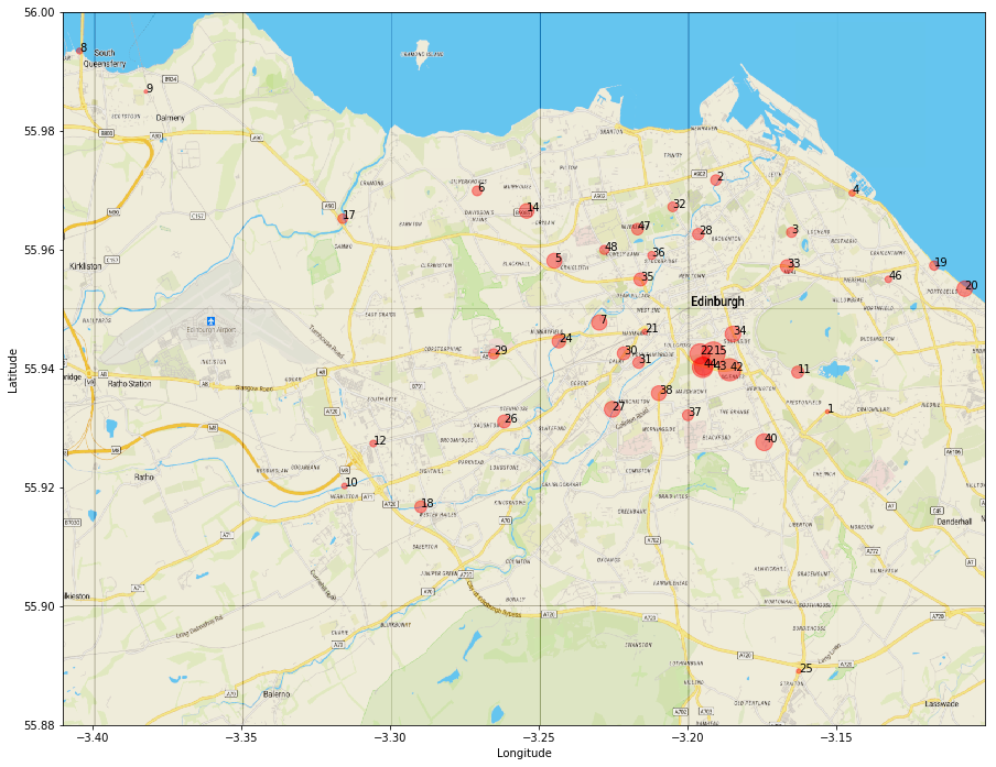
Once we do this we get a nice plot visually indicating the level of traffic at each location.
A workbook and the data associated with this project can be found on Github. The original dataset is available via this link and is licensed under the Open Government License. Map data is via Open StreetMap.