Currently there is a fun competition running over on the Kaggle Data Science website.
The objective is to use metrics from a large data set of Player Unknown Battle Grounds (PUBG) matches to build a model to predict performance in the game. This blog post covers my exploratory data analysis of the dataset.
Fist of course we need to load come python libraries and the data we plan to analyse
# library import
import pandas as pd
import numpy as np
import matplotlib.pyplot as plt
import seaborn as sns
import os, sys

# data import
pubg_train = pd.read_csv('train_V2.csv')
pubg_test = pd.read_csv('test_V2.csv')
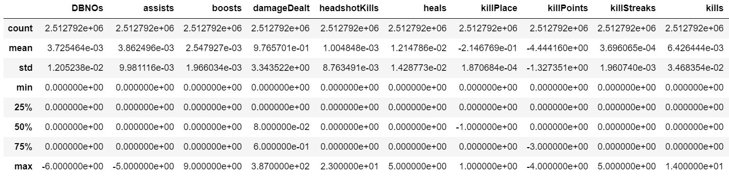
One of the very first things to do is to check that the training and testing sets are drawn from the same distribution. This can easily be done by checking that one dataset’s basic statistics given by describe are similar to the the other’s. Subtracting the testing set’s describe dataframe from the training set’s dataframe and then dividing by the training set’s describe dataframe should give values close to zero for each mean and quartile figure being small if the data sets contain similar distributions and this is indeed what we see.
pubg_train_stats =  pubg_train.describe()
pubg_test_stats =  pubg_test.describe()
pubg_train_stats.drop(columns = 'winPlacePerc')
train_test_difference = pubg_train_stats - pubg_test_stats
train_test_difference
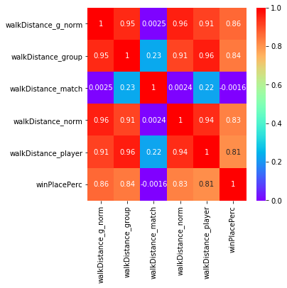
Having established that the sets are drawn from the same distributions, we shall focus of the training set for visualisation and analysis. Lets start with a correlation plot to identify the most significant variables.
corr_vals = pubg_train.corr()
fig, axes = plt.subplots(figsize=(15,15))
sns.heatmap(corr_vals, ax = axes, cmap="rainbow", annot=True);

Looking at the bottom row we can see strong correlation between our target variable “winPlacePerc” and other variables such as boosts, killPlace, walkDistance and weaponsAcquired, and reasonable correlation with a number of other variables. We can also clearly see that some variables are not well correlated with our target and are likely to be of less use to us.
These results makes considerable intuitive sense. PUBG is battle royale style game where 100 players try to stay alive. Players start with no weapons so obviously acquiring weapons will be useful, so will killing enemies since otherwise they will kill you. Also the game features a shrinking play area which forces players to travel accounting for the usefulness of walking or otherwise travelling long distances.
Next lets plot some 2 dimensional KDE plots of the most significant variables against the target variable. Doing this on the entire dataset takes an exhorbitant amount of time and memory. As the data comes pre-shuffled, we can simply take a 1% sample of the data to give us a small enough dataset to work with more easily.
# lets see how each individual variable is related to the target variable
# note that to finish in a reasonable time we need to take a subset
pubg_small = pubg_train[0:-1:100]

# select interesting correlated columns
column_list = [
'damageDealt', 'DBNOs', 'heals',
'killPlace', 'kills',
'killStreaks', 'rideDistance', 'walkDistance',
'weaponsAcquired']
pubg_clipped = pubg_small[column_list+['winPlacePerc']]

# clip off extremes to get nice plots
pubg_clipped = pubg_clipped.clip(
    lower=None, upper= pubg_clipped.quantile(0.999),
    axis = 1)

# cycle though columns to look at correlation
for column in column_list:
    sns.jointplot(x = column, y = "winPlacePerc",
        data = pubg_clipped, kind = "kde")
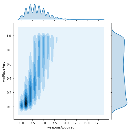
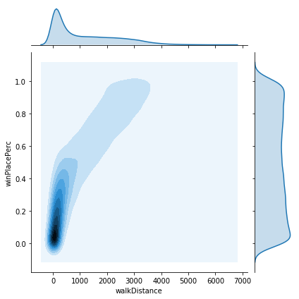
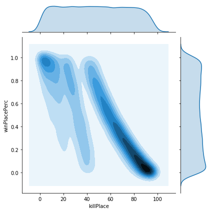
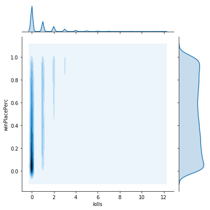
The plots show a variety of different relationships to winPlacePerc. Some of these look reasonably linear, however some seem to be rather more complicated. We should check this, since if the data is non-linear, then we may need a more sophisticated model to account for this. The easiest way is to try to plot a polynomial regression to the data and look to see if we get a monotonically increasing line. If not then it is unlikely linear regression will give us a good fit.
#cycle though columns to look at how linear the correlation is
for column in column_list:
fig, axes = plt.subplots(figsize=(6,6))
ax = sns.regplot(x = column, y = "winPlacePerc", data = pubg_clipped,
scatter_kws={"s": 80}, order=3, line_kws={'color':'red'},
robust = False, ci=None, truncate=True)
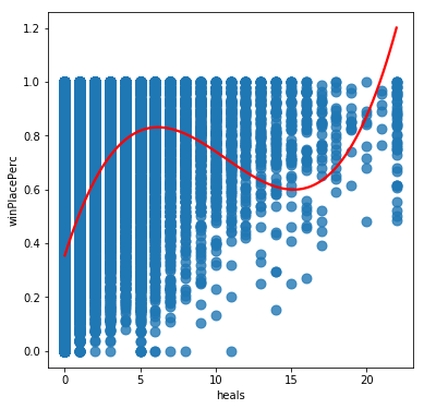
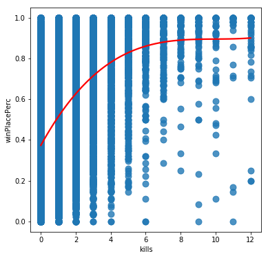
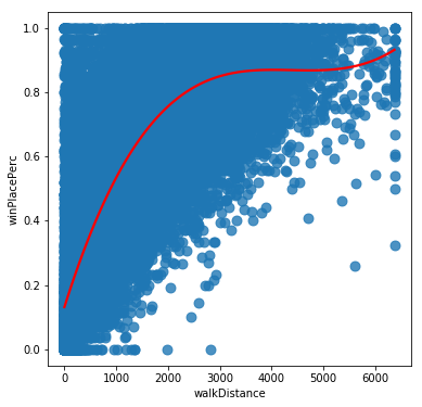
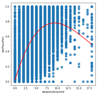
From these we can see that while some variables like Walk distance and kills could be approximated by a linear relationship, others such as weaponsAcquired have a definite sweet spot for high winPlacePercentage scores, and others such as heals have a complicated relationship possibly suggesting a number of competing strategies being used by effective players. It seems likely that we will need to base our model on something more sophisticated than linear regression for this challenge.
Now lets try to conduct some engineering on these features. A number of possibilities spring to mind.
- Some modes are played as teams, perhaps we should look at team aggregate variables
- We could normalise the variables with respect to the average scores in the matches they correspond to
- Perhaps we could extract information about player skill by comparing ratios between pickups and distance walked, or kills and headshot kills
Lets implement these and see if our engineered variables are more highly correlated with our target variable
# set up our feature engineering labels

# list of the variables suspected to be significant in data analysis

variables = ['killPlace', 'boosts', 'walkDistance', 'weaponsAcquired',
    'damageDealt', 'heals', 'kills', 'longestKill', 'killStreaks',
    'rideDistance','rampage', 'lethality', 'items', 'totalDistance']

keep_labels = variables + ['matchId','groupId',
    'matchType', 'winPlacePerc']

def feature_engineering(pubg_data):
    '''FEATURE ENGINEERING
    GIVEN: a PUBG dataframe which must have a dummy 'winPlacePerc'
    column if a test set. Conduct data engineering including:
    producing group data, normalising data with relevant match stats,
    clipping extreme results
    RETURNS: pubg_x dataframe consisting of feature engineered input columns
    pubg_y dataframe with target values (0 dummy frame if a test set)
    '''

    # total the pickups
    pubg_data['items'] = pubg_data[
        'heals'] + pubg_data['boosts'] + pubg_data["weaponsAcquired"]

    # total the distance
    pubg_data['totalDistance'] = pubg_data[
        'rideDistance'] + pubg_data[
        'swimDistance'] + pubg_data['walkDistance']

    # estimate accuracy of players
    pubg_data['lethality'] = pubg_data[
        'headshotKills'] / pubg_data['kills']
    pubg_data['lethality'].replace(np.inf, 0, inplace=True)
    pubg_data['lethality'].fillna(0, inplace=True)

    # estimate how players behave in shootouts
    pubg_data['rampage'] = pubg_data[
        'killStreaks'] / pubg_data['kills']
    pubg_data['rampage'].replace(np.inf, 0, inplace=True)
    pubg_data['rampage'].fillna(0, inplace=True)

    # reduce dataframe to the columns we want to use
    pubg_data = pubg_data[keep_labels]

    # use groupby to get means for team
    pubg_group_means = pubg_data.groupby([
        'matchId','groupId']).mean().reset_index()

    # use groupby to get means of matches
    pubg_match_means = pubg_data.groupby([
        'matchId']).mean().reset_index()

    # merge back in leaving columns unchanged for one set to allow for
    # future suffixing (only affects shared columns)
    pubg_engineered = pd.merge(pubg_data, pubg_group_means,
    suffixes=["", "_group"], how = "left", on = ['matchId', 'groupId'])
    pubg_engineered = pd.merge(pubg_engineered, pubg_match_means,
    suffixes=["_player", "_match"], how = "left", on = ['matchId'])

    # norm the player variables
    for variable in variables:
        pubg_engineered[variable+'_norm'] = pubg_engineered[
            variable+'_player']/(pubg_engineered[variable+'_match']+0.1)

    # norm the group variables
    for variable in variables:
        pubg_engineered[variable+'_g_norm'] = pubg_engineered[
            variable+'_group']/(pubg_engineered[variable+'_match']+0.1)

    # one hot encode the matchTypes since different matches
    # may follow different logics
    one_hot = pd.get_dummies(pubg_engineered['matchType'])

    # Drop matchType column as it is now encoded
    pubg_engineered = pubg_engineered.drop('matchType',axis = 1)

    # Join the encoded df
    pubg_engineered = pubg_engineered.join(one_hot)
    pubg_engineered.drop(columns = ['winPlacePerc_group',
        'winPlacePerc_match'], inplace = True)
    pubg_engineered.rename(columns = {
        'winPlacePerc_player': 'winPlacePerc'}, inplace = True)
    pubg_engineered = pubg_engineered.reset_index(drop=True)

    return pubg_engineered
We can use this function to engineer our new variables. Having done this we can then plot correlation plots between the differently engineered forms of each variable to see which ones are most significant.
# must train on the full set to get correct group and match means
pubg_engineered = feature_engineering(pubg_train)
# group related cloumns together
pubg_engineered = pubg_engineered.sort_index(axis=1)

# grab our columns
available_columns = list(pubg_engineered.columns.values)
# work out where each group of variables we want to compare start
start_values = [0,7,17,22,27,32,37,42,47,59,64,73,78,83]

# loop over our subsets creating correlation plots
for start in start_values:
    column_selection = available_columns[
        start: start+5] + ['winPlacePerc']
    corr_vals = pubg_engineered[column_selection].corr()

    fig, axes = plt.subplots(figsize=(5,5))
    sns.heatmap(corr_vals, ax = axes,
        cmap="rainbow", annot=True);


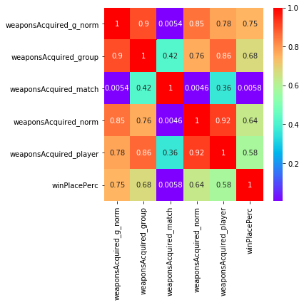
The correlation plots clearly show that the grouped and normed features show a higher correlation with winPlacePerc than the variables before engineering. Clearly we should consider including them in our model.
For brevity not all the variables have been illustrated here. If you wish to investigate more closely yourself, the notebook to is available on Kaggle.