GIMP 2.10 has lots of nice new features. However a less desirable feature is that upon initial install GIMP’s tool icons are now monochrome, cryptic, and low contrast. Worse still they have been placed into tool groups. This makes selecting tools a two step rather than one step process. The reasons for these design decisions are unclear but certainly I find them unhelpful.
Fortunately the older icons are still available so lets get them back and add a couple of other quality of life improvements to the interface.
First go to Edit>Preferences and find the Interface>Icon Theme tab. Here you can select the old Color theme which is much easier to parse and you can also adjust the icon size
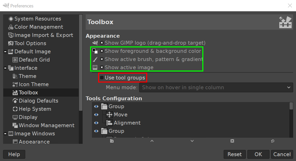
Remaining in the preferences pane select Interface>Toolbox. Uncheck Use tool groups. You can also opt to show things like the active brush and image in these Toolbox options.to give you small visual hints in the tool pane.
Now your left hand tool panel in GIMP should look like this and be a lot more useable. Enjoy.