Missing values in data sets may not seem like too much of a problem at first glance. The rows can be ignored, average values can be input or the data can be marked as missing. However applying the wrong strategy can lead to serious errors of interpretation. Lets take a look at a concrete example in that old favourite of a data set, the Titanic survival training data set. Note that for simplicity only the training data from the Kaggle challenge is being examined here.
First lets import our data obtained from the link above and take a quick look at it:
# Import libraries
import matplotlib
import pandas as pd
import numpy as np
import seaborn as sns

# Enable inline printing
%matplotlib inline

# Import our data
titanic_train = pd.read_csv("train.csv")
# Make the Survived column more human readable
titanic_train["Survived"] = titanic_train["Survived"]
    .map({1: "Yes", 0:"No"})
# Then display
titanic_train.head()
We can see that some passengers have a cabin assigned to them, looking through the data we realise that the first letter of the cabin is the deck assignment. A little historical research indicates that deck may be correlated with passenger class since first class had the top decks (A-E), second class (D-F), and third class (E-G). Which deck people were on seems likely to affect survival, after all the lifeboats are on the upper decks so we decide to investigate deck assignments more closely.
First we need to extract the deck information, then we can visualise the relationship between deck and survival.
# create a new column using the first letter of the cabin column
titanic_train["Deck"] = titanic_train["Cabin"].dropna().
    astype(str).str[0].str.upper()</pre>
# remove anomalous deck assignment "T"
titanic_train.loc[titanic_train["Deck"] == "T"] = np.nan

# Plot survival versus deck
sns.countplot("Survived", data = titanic_train, hue="Deck",
hue_order = ["A", "B", "C", "D", "E", "F", "G"],
    order=["Yes", "No",]);
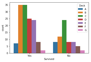
Looking at this naively it would appear that the survival rates on deck G is as good as the survival rate on deck A, the survival rates on decks D and E are better than that on deck B and the survival rate on deck F is better than that of deck C. Given that second and third class passengers occupied decks D-G it might appear that they actually fared reasonably well during the sinking. However the graph above is actually highly misleading.
The first indication that all is not as it might seem is that according to the plot by deck, more than half the passengers survived. However a knowledge of history (or plotting the whole training data set) reveals the situation is actually very different. In fact far less than half the passengers in the data set survive.
# plot the whole dataset
sns.countplot("Survived", data = titanic_train,
    order=["Yes", "No"]);

So what is the cause of the discrepancy? Well lets add a bar the passengers for whom we have no cabin data to our survival by deck plot.
# Run fillna on the NaNs and plot again
titanic_train["Deck"] = titanic_train["Deck"].fillna("N")

# Visualise what happened to those for whom we have
# no deck indication alongside those we do
sns.countplot("Survived", data=titanic_train, hue="Deck",
hue_order = ["A", "B", "C", "D", "E", "F", "G", "N"],
    order = ["Yes", "No"]);

Now we can clearly see our issue, the rows with deck allocations and those without are not drawn from the same distributions. This means that inferences we draw about one population have no reason to transfer to the other population.
Lets investigate a little further by adding a column noting whether or not we have a deck allocation for a given passenger so that we can plot this information directly
# lets add a column indicating whether the cabin is known
titanic_train["KnownDeck"] = titanic_train["Deck"]
    .apply(lambda x: "No" if x == "N" else "Yes")

# Now display the distribution of survivors
sns.countplot("Survived", data=titanic_train,
    hue="KnownDeck");

Here the difference can be seen very starkly, having a known deck is highly correlated with passenger survival.
What if we break down the survivors by class, whether they survived and whether they had a known deck allocation?
# Now lets plot to see if the cabins we have are a
# representative sample across passenger classes
grid = sns.FacetGrid(titanic_train, row ="KnownDeck",
    row_order = ["Yes", "No"], col= "Pclass", height=4, aspect=1)
grid.map(sns.countplot, "Survived", order = ["Yes", "No"]);

Here we can see that regardless of class, if you survived we are more likely to have a deck allocation. Also we can see that first class passengers were most likely to survive and third class least likely to survive which is more in line with the known facts of the disaster.
But why are having a known deck and survival highly correlated? Well it seems unlikely that having a known deck caused passengers to survive. More likely causation works the other way round in this case. The data set records cabin numbers where they are known and this is more likely if the passenger survived. The data set on survivors will have been compiled after the sinking and so the survival bias on deck numbers suggests that cabin allocations were mostly recorded for survivors. A higher proportion of first class victims have known cabin allocations than second and third class, so perhaps first class allocations were recorded by the White Star Line and the few other cabin allocations that are known were discovered by questioning survivors.
In this case the effect of the missing values is fairly obvious, however imagine a less famous case and imagine that instead of retaining the rows with missing data we had initially “cleaned” our data using
titanic_train.dropna()
In such a case we would not necessarily get any intuition that the conclusions we are drawing are on shaky ground. After all if we already knew the answers, we would not need to look at the data. This could have led to serious errors in our conclusions. Missing values need to be treated with care, think and check before you drop them or fill them.